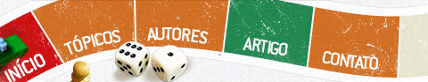
基于CSS的网站导航菜单
时间:2016-04-11基于CSS的网站导航菜单.
Loodo
A colorful menu that adds to the feel of the website.
Acko.net
Steven Wittens takes a look at the navigation menu from a quite unusual perspective.

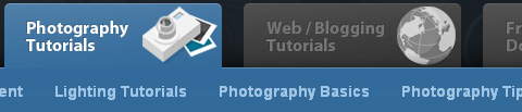
Web Design Ledger
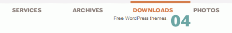
Web Design Ledger has an excellent menu; its large size is convenient but doesn’t intrude on the content.

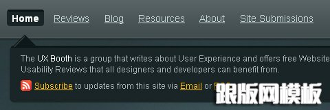
UX Booth
UX Booth uses a a stylish text box under the navigation as a sort of subtext for each menu item.
Nopokographics
Vertical navigation menus are used very rarely, for the simple reason: they are harder to use. However, some designers risk unusual approaches. Nopoko Graphics uses an arrow and a hover-effect for its vertical navigation menu.

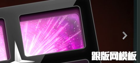
Icon Designer
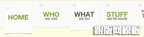
This website uses a large image-based menu on the home page. The user’s attention is drawn directly to this large menu, making it convenient for users.
Cosmicsoda
This large and colorful menu is very noticeable and uses a slight hover effect to further define the menu items.

Designsensory
An intuitive drop-down navigation that uses 2 colors effectively to communicate the active navigation item and the passive ones.

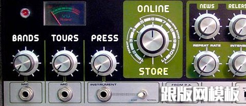
Smallstone
Smallstone, a U.S. record label, presents its navigation menu in the form of a the so-called Space Echo Roland SE-201.
TNVacation
It’s pretty hard to find a nice-looking drop-down menu. This one is a beautiful exception.

Clearleft
Clearleft uses a couple of paper pieces for its navigation.
#p#副标题#e#
基于CSS的网站导航菜单.
45royale
A simple, clean and beautiful navigation with a nice hover effect.

Design Intellection
An excellent example of block navigation that shows how effectively “speaking” hover effects can be used with a clean and simple navigation menu.
Ronnypries.de
A navigation menu doesn’t have to look like a traditional navigation menu. Ronny Pries uses a floor plan to lead site visitors through the pages of the site.

Jiri Tvrdek
Jiri Tvrdek presents the navigation options of his site as leaves on a tree. Creative, unusual and memorable.

Water’s Edge Media
Patricia Abbott uses clothespins for the navigation options.

Matt Dempsey
Matt Dempsey highlights his navigation options with a brush stroke.

Cognigen
The current navigation option is pressed — clear and intuitive.

District Solutions
Vertical tabs are used very rarely. But they can look good!

Jayme Blackmon
Jayme Blackmon seems to like setting “done”-marks…

Jeff Sarmiento
Why not try a sloping navigation options once in a while?

#p#副标题#e#
基于CSS的网站导航菜单.
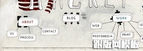
Studioracket
A really unusual navigation menu that uses some kind of a mindmap to illustrate the navigation. And, apart from that, the navigation menu is hand-drawn!
Cultured Code
A subtle yet distinct menu that is out of the way of content. Excellent colors and a nice hover effect also add to the menu.

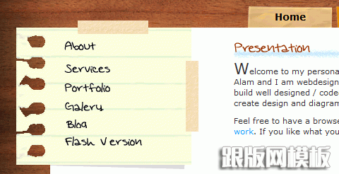
Nando Designer
This Portuguese designers uses handwriting and a piece of paper for its main navigation.
Bonfiremedia
Sometimes typography is just enough…

Artgeex
Vivid typography in use.

Gloobs
Some designers integrate a stamp in the contact navigation option.

South Creative
This website uses large navigation buttons and has a good hover effect.

Mac Rabbit
One more example of a large and clean menu. This one uses icons to aid the reader in recognizing each item’s function.

RapidWeaver
This menu has a clean and smooth layout, and it has a great sub-menu that uses transparency to separate it from the main menu.

DFW UPA
Icons reinforce the menu items on this website and add emphasis to each option.

Revolution Driving Tuition
This website has a great grunge style, and the menu fits right into the layout.

Duarte Pires
This menu is located close to the content, where it is easy to use. It uses large icons, which adds a visual element to the navigation. Also, the menu on other pages uses the same icons in a vertical layout, bringing consistency to the website. The icons may not fit perfectly, but it’s a nice idea.

Valetin Agachi
This navigation has a rather unique style that emphasizes selected items. Also, the menu layout stays consistent throughout the whole website.

Tutorial9
Tutorial9 recently got a nice redesign, which came with a very usable and well-organized menu.
相关文章
 基于HTML5实现的超炫Web效果HTML5可不是什么虚幻的概念,与其高谈阔论的讨论HTML5未来的趋势和价值,不如一起研究一下现在的HTML5可以做出哪些成果,可以让我们做出出色的产品。 Form Follo
 html中下拉菜单选项添加链接打开超链接在新窗口打开 SELECT name="phpddt" onchange="window.open(this.options[this.selectedIndex].value,'_blank')" size=1 OPTION selected点击即可进入/OPT
 基于html5开发的8个优秀网站展示真的不想说什么了,太优秀了,这才是真正的网站。。。。。 1. Draw Stick Man II html5的交互性,这才叫用户体验度 2. Air Jordan 2012 极其优秀的视觉效果 3. A
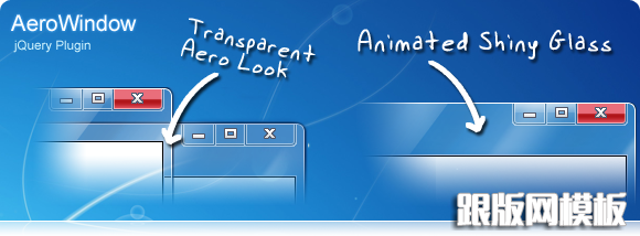 AeroWindow 基于JQuery的弹出窗口插件-jquery跟版精品模板网提供AeroWindow,等网页设计素材资源,提供相关网页设计资源的教程和免费下载。跟版网,专业织梦网页设计模板资源站。。
 33个优秀的jQuery 教程分享(幻灯片、动画菜单)-jquery跟版精品模板网提供jQuery,教程,等网页设计素材资源,提供相关网页设计资源的教程和免费下载。跟版网,专业织梦网页设计模板资源站。。
- 基于jquery的回到页面顶部按钮-jquery跟版精品模板网提供页面顶部,等网页设计素材资源,提供相关网页设计资源的教程和免费下载。跟版网,专业织梦网页设计模板资源站。。
 js实现点击按钮复制文本功能最近遇到一个需求,需要点击按钮,复制 p 标签中的文本到剪切板 之前做过复制输入框的内容,原以为差不多,结果发现根本行不通 尝试了各种办法,最后使了个障眼法,实现了
 何为百度移动网站MIP?MIP对网站有什么帮助?随着移动互联网的发展,网友们对于移动产品服务体验要求也越来越高,当然了像移动网站体验也包括在内,随着互联网技术的发展,现在移动网站页面技术也一直在提升和创新,今