如何根据屏幕大小使用 CSS 隐藏或显示内容?
时间:2023-09-30问题描述
就像 Bootstrap 一样,Ionic (Ionic 3) 允许我们使用 col-sm-8、col-md-6 根据屏幕大小调整列的宽度, col-lg-4.Bootstrap 还附带了诸如 visible-xs、hidden-sm 等类,使我们能够根据屏幕大小显示或隐藏内容.Ionic 3 是否附带任何可以让我们做同样事情的东西?
Just like Bootstrap, Ionic (Ionic 3) lets us resize the width of a column based on screen size using col-sm-8, col-md-6, col-lg-4. Bootstrap also comes with classes like visible-xs, hidden-sm, etc. that enables us to show or hide content according to the screen size. Does Ionic 3 ship with anything that lets us do the same?
推荐答案
我将以下 CSS 类从 Bootstrap 4 Alpha 复制到我的项目中,它们运行良好.
I copied the following CSS classes from Bootstrap 4 Alpha into my project and they work perfectly.
.invisible {
  visibility: hidden !important;
}

.hidden-xs-up {
  display: none !important;
}

@media (max-width: 575px) {
  .hidden-xs-down {
    display: none !important;
  }
}

@media (min-width: 576px) {
  .hidden-sm-up {
    display: none !important;
  }
}

@media (max-width: 767px) {
  .hidden-sm-down {
    display: none !important;
  }
}

@media (min-width: 768px) {
  .hidden-md-up {
    display: none !important;
  }
}

@media (max-width: 991px) {
  .hidden-md-down {
    display: none !important;
  }
}

@media (min-width: 992px) {
  .hidden-lg-up {
    display: none !important;
  }
}

@media (max-width: 1199px) {
  .hidden-lg-down {
    display: none !important;
  }
}

@media (min-width: 1200px) {
  .hidden-xl-up {
    display: none !important;
  }
}

.hidden-xl-down {
  display: none !important;
}
文档:https://v4-alpha.getbootstrap.com/layout/responsive-utilities/
这篇关于如何根据屏幕大小使用 CSS 隐藏或显示内容?的文章就介绍到这了,希望我们推荐的答案对大家有所帮助,也希望大家多多支持跟版网!
相关文章
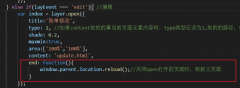 layer.open打开的页面关闭时,父页面刷新的方法layer.open打开的页面关闭时,父页面刷新的方法,在layer.open中添加: end: function(){ window.parent.location.reload();//关闭open打开的页面时,刷新父页面 }
- ionic3 - 错误错误:未捕获(承诺):错误:InvalidPipeArgument:'[object Ob
- 模块解析失败:意外的令牌离子 3
- 键盘向上推动一个 div &走出屏幕
- 将 scss 文件添加到 Stackblitz
- 使用 Sass/Compass 的多个背景图像
- 将字节数组转换为图像 Node.js
- CryptoKey ArrayBuffer 到 base64 并返回
- jpeg 的有效 base64 字符串
- 在 JavaScript 中使用两种方式散列 JSON 字符串以用于 URL
- 对 base64 URI 支持的更好测试(我可以在 JS 中创建一个大的 base64 编码图像吗?)